Exam Code: DA-100 (Practice Exam Latest Test Questions VCE PDF)
Exam Name: Analyzing Data with Microsoft Power BI
Certification Provider: Microsoft
Free Today! Guaranteed Training- Pass DA-100 Exam.
Online DA-100 free questions and answers of New Version:
NEW QUESTION 1
You are building a financial report by using Power BI.
You have a table named financials that contains a column named Date and a column named Sales.
You need to create a measure that calculates the relative change in sales as compared to the previous quarter. How should you complete the measure? To answer, select the appropriate options in the answer area. NOTE: Each correct selection is worth one point.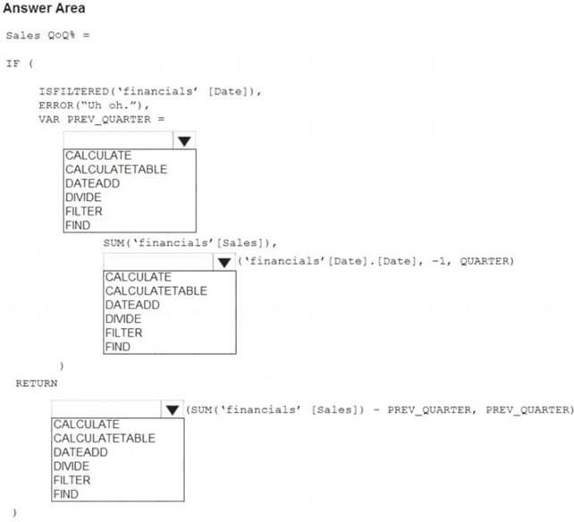
Solution:
Graphical user interface, text, application Description automatically generated
Box 1: CALCULATE
Box 2: DATEADD
Box 3: DIVIDE
Example: NET_SALES QoQ% = IF(
ISFILTERED('Calendar'[Date]),
ERROR("Time intelligence quick measures can only be grouped or filtered by the Power BI-provided date hierarchy or primary date column."),
VAR PREV_QUARTER =
CALCULATE(
SUM('research ra_qtr_template'[NET_SALES]), DATEADD('Calendar'[Date].[Date], -1, QUARTER)
) RETURN DIVIDE(
SUM('research ra_qtr_template'[NET_SALES]) - PREV_QUARTER,
PREV_QUARTER
)
)
Reference:
https://community.powerbi.com/t5/Desktop/Error-calculating-QOQ-using-quick-measure/m-p/547054
Does this meet the goal?
- A. Yes
- B. Not Mastered
Answer: A
NEW QUESTION 2
You have a report that contains four pages. Each page contains slicers for the same four fields. Users report that when they select values on a slicer on one page, the visuals are not updated on all the pages. You need to recommend a solution to ensure that users can select a value once to filter the results on all the pages. What are two possible recommendations to achieve this goal? Each correct answer presents a complete solution. NOTE: Each correct selection is worth one point.
- A. Sync the slicers across the pages.
- B. Replace the slicers with page-level filters.
- C. Replace the slicers with visual-level filters.
- D. Create a bookmark for each slicer value.
- E. Replace the slicers with report-level filters.
Answer: AE
Explanation:
Add a report-level filter to filter an entire report.
The visuals on the active page, and on all pages in the report, change to reflect the new filter. You can sync a slicer and use it on any or all pages in a report.
* 1. On the Power BI Desktop View menu, select Sync slicers.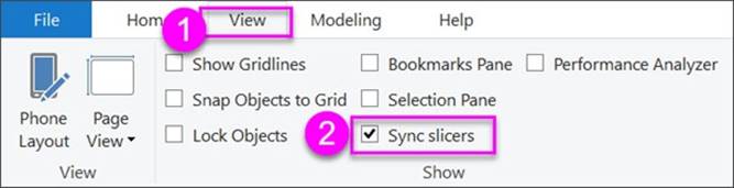
The Sync slicers pane appears between the Filters and Visualizations panes.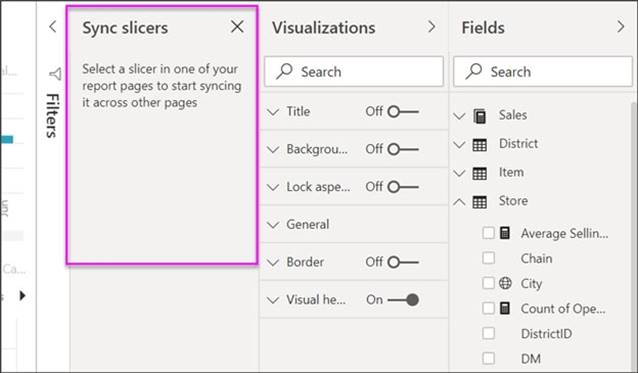
Reference:
https://docs.microsoft.com/en-us/power-bi/create-reports/power-bi-report-add-filter https://docs.microsoft.com/en-us/power-bi/visuals/power-bi-visualization-slicers
NEW QUESTION 3
You are creating an analytics report that will consume data from the tables shown in the following table.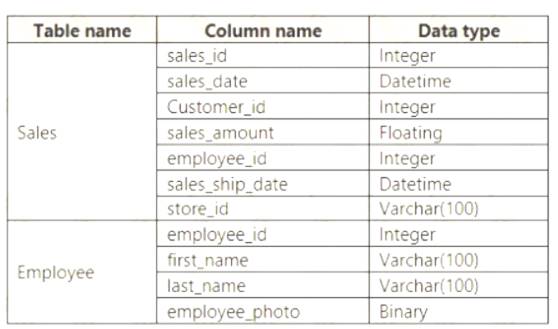
There is a relationship between the tables.
There are no reporting requirements on employeejd and employee_photo. You need to optimize the data model
What should you configure for employeejd and employee.photo? To answer, select the appropriate options in the answer area.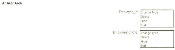
Solution:
Table Description automatically generated
Box 1: Hide
Optimize data by hiding fields and sorting visualization data
Box 2: Delete
The fastest way to optimize your Power BI report is to limit the number of columns to only the ones you need in your data model. Go through your tables in Power Query and determine what fields are being used. Delete these columns if they are not being used in any of your reports or calculations.
Reference:
https://tessellationtech.io/optimizing-power-bi-reports/
Does this meet the goal?
- A. Yes
- B. Not Mastered
Answer: A
NEW QUESTION 4
You receive revenue data that must be included in Microsoft Power Bl reports.
You perform an initial load of the data from a Microsoft Excel source as shown in the following exhibit.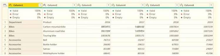
You plan to create several visuals from the data, including a visual that shows revenue split by year and product.
You need to transform the data to ensure that you can build the visuals. The solution must ensure that the columns are named appropriately for the data that they contain.
Which three actions should you perform in sequence? To answer, move the appropriate actions from the list of actions to the answer area and arrange them in the correct order.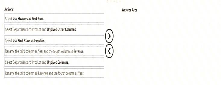
Solution:
Text Description automatically generated with medium confidence
Step 1: Select Use Header as First Row.
Step 2: Select Department and Product and Unpivot Other Columns
Unpivot Other Columns: This command unpivots unselected columns. Use this command in a query when not all columns are known. New columns added during a refresh operation are also unpivoted.
Step 3: Rename the Attribute column to Year and the Value column to Revenue.
You might want to unpivot data, sometimes called flattening the data, to put it in a matrix format so that all similar values are in one column. This is necessary, for example, to create a chart or a report.
Chart Description automatically generated with medium confidence
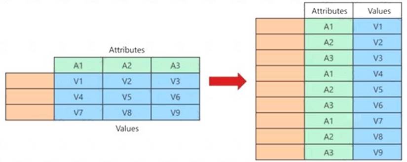
When you unpivot, you unpack the attribute-value pairs that represent an intersection point of the new columns and re-orient them into flattened columns:
Values (in blue on the left) are unpivoted into a new column (in blue on the right).
Attributes (in green on the left) are unpivoted into a new column (in green on the right) and duplicates are correspondingly mapped to the new Values column.
Reference:
https://support.microsoft.com/en-us/office/unpivot-columns-power-query-0f7bad4b-9ea1-49c1-9d95-f588221c7
Does this meet the goal?
- A. Yes
- B. Not Mastered
Answer: A
NEW QUESTION 5
You need to create the On-Time Shipping report.
The report must include a visualization that shows the percentage of late orders. Which type of visualization should you create?
- A. scarterplot
- B. bar chart
- C. piechart
Answer: A
NEW QUESTION 6
You plan to create the chart shown in the following exhibit.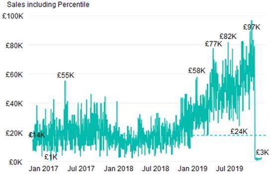
How should you create the dashed horizontal line denoting the 40th percentile of daily sales for the period shown?
- A. Create a horizontal line that has a fixed value of 24,000.
- B. Add a measure to the visual that uses the following DAX expression.Heasurel - PERCENTUEX.EXC (Sales,Sales[Total Sales],©.40)
- C. Add a new percentile line that uses Total Sales as the measure and 40% as the percentile.
- D. Add a measure to the visual that uses the following DAX expression.Heasurel = PERCENTILEX.INC (Sales,Sales[Total Sales],6.40)
Answer: C
Explanation:
The analytics feature enables you to show percentiles across groups specified along a specific axis. Example:
* 1. Click on the analytics tab
* 2. Select Percentile
* 3. You can choose a specific percentile along with other formatting options.
* 4. Drag a date or non-numeric dimension into the Axis of a column chart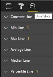
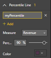
Add percentile lines to monitor daily revenue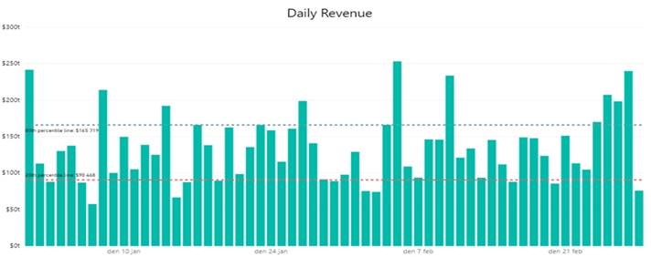
NEW QUESTION 7
You have a report page that contains the visuals shown in the following exhibit.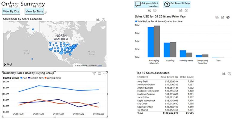
Use the drop-down menus to select the answer choice that completes each statement based on the information presented in the graphic. NOTE: Each correct selection is worth one point.
Solution:
Box 1: cross-filter
By default, selecting a data point in one visual on a report page will cross-filter or cross-highlight the other visuals on the page.
Box 2: cross-highlight
Example:
By default, selecting a data point in one visual on a report page will cross-filter or cross-highlight the other visuals on the page.
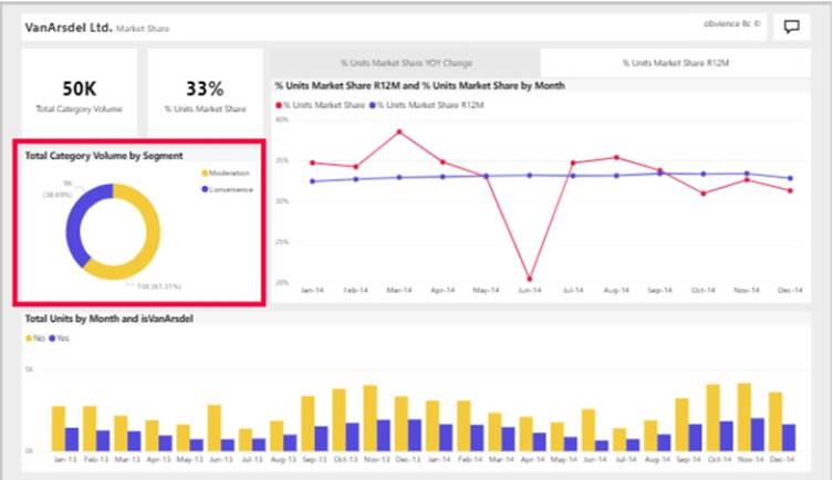
* 1. Let's see what happens when we select Moderation.
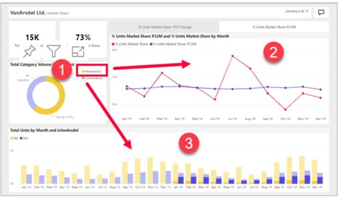
* 2. Cross-filtering removes data that doesn't apply. Selecting Moderation in the doughnut chart cross-filters the line chart. The line chart now only displays data points for the Moderation segment.
* 3. Cross-highlighting retains all the original data points but dims the portion that does not apply to your selection. Selecting Moderation in the doughnut chart cross-highlights the column chart. The column chart dims all the data that applies to the Convenience segment and highlights all the data that applies to the Moderation segment.
Reference:
https://docs.microsoft.com/en-us/power-bi/consumer/end-user-interactions
Does this meet the goal?
- A. Yes
- B. Not Mastered
Answer: A
NEW QUESTION 8
You have multiple dashboards.
You need to ensure that when users browse the available dashboards from powerbi.com, they can see which dashboards contain Personally Identifiable Information (PII). The solution must minimize configuration effort and impact on the dashboard design.
What should you use?
- A. comments
- B. tiles
- C. Microsoft Information Protection sensitivity labels
- D. Active Directory groups
Answer: D
Explanation:
Microsoft Information Protection sensitivity labels provide a simple way for your users to classify critical content in Power BI without compromising productivity or the ability to collaborate.
Sensitivity labels can be applied to datasets, reports, dashboards, and dataflows. Reference:
https://docs.microsoft.com/en-us/power-bi/admin/service-security-sensitivity-label-overview
NEW QUESTION 9
You need to design the data model to meet the report requirements. What should you do m Power Bl Desktop?
- A. From Power Query, add columns to the Orders table to calculate the calendar quarter and the calendar month of the OrderDate column.
- B. From Power Bi Desktop, use the Auto date/time option when creating the reports.
- C. From Power Query, add a date tabl
- D. Create an active relationship to the OrderDate column in the Orders table and an inactive relationship to the ShippedDate column in the Orders table.
- E. From Power Query, use a DAX expression to add columns to the Orders table to calculate the calendar quarter of the OrderDate column, the calendar month of the OrderDate column, the calendar quarter ofthe ShippedDate column, and the calendar month of the ShippedDate column
Answer: D
NEW QUESTION 10
What should you create to meet the reporting requirements of the sales department?
- A. a measure that uses a formula of SUM (Sales [sales_id])
- B. a calculated column that use a formula of COUNTA(sales [sales_id])
- C. a measure that uses a formula of COUNTROWS (Sales)
- D. a calculated column that uses a formula of SUM (Sales [sales_id])
Answer: C
Explanation:
The sale department requires reports that contain the number of sales transactions.
The COUNTROWS function counts the number of rows in the specified table, or in a table defined by an expression.
Reference:
https://docs.microsoft.com/en-us/dax/countrows-function-dax
NEW QUESTION 11
You have four sales regions. Each region has multiple sales managers.
You implement row-level security (RLS) in a data model. You assign the relevant distribution lists to each role.
You have sales reports that enable analysis by region. The sales managers can view the sales records of their region. The sales managers are prevented from viewing records from other regions.
A sales manager changes to a different region.
You need to ensure that the sales manager can see the correct sales data. What should you do?
- A. From Microsoft Power Bl Desktop, edit the Row-Level Security setting for the reports.
- B. Change the Microsoft Power Bl license type of the sales manager.
- C. Manage the permissions of the underlying dataset
- D. Request that the sales manager be added to the correct Azure Active Directory group.
Answer: D
Explanation:
Using AD Security Groups, you no longer need to maintain a long list of users.
All that you will need to do is to put in the AD Security group with the required permissions and Power BI will do the REST! This means a small and simple security file with the permissions and AD Security group.
Note: Configure role mappings
Once published to Power BI, you must map members to dataset roles.
Members can be user accounts or security groups. Whenever possible, we recommend you map security groups to dataset roles. It involves managing security group memberships in Azure Active Directory. Possibly, it delegates the task to your network administrators.
Reference:
https://www.fourmoo.com/2018/02/20/dynamic-row-level-security-is-easy-with-active-directory-security-group
https://docs.microsoft.com/en-us/power-bi/guidance/rls-guidance
NEW QUESTION 12
You have a dashboard that contains tiles pinned from a single report as shown in the Original Dashboard exhibit. (Click the Original Dashboard tab.)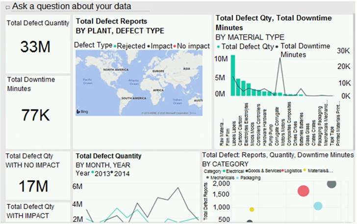
You need to modify the dashboard to appear as shown in the Modified Dashboard exhibit. (Click the Modified Dashboard tab.)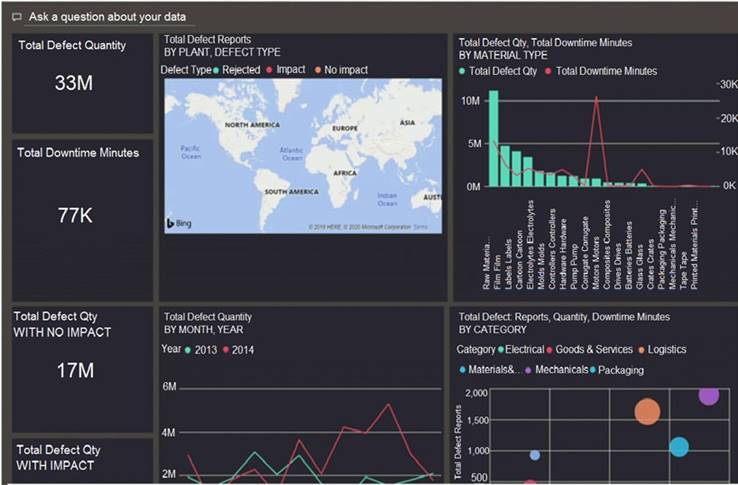
What should you do?
- A. Edit the details of each tile.
- B. Change the report theme.
- C. Change the dashboard theme.
- D. Create a custom CSS file.
Answer: C
Explanation:
https://docs.microsoft.com/en-us/power-bi/create-reports/service-dashboard-themes#how-dashboard-themes-wo
NEW QUESTION 13
You need to create the required relationship for the executive's visual. What should you do before you can create the relationship?
- A. Change the data type of Sales[region_id] to Whole Number.
- B. In the Sales table, add a measure for sum(sales_amount).
- C. Change the data type of sales[sales_id] to Text.
- D. Change the data type of sales [region_id] to Decimal Number.
Answer: A
Explanation:
Scenario: Executives require a visual that shows sales by region.
Need to change the sales_id column from Varchar to Whole Number (Integer).
NEW QUESTION 14
You have a sales system that contains the tables shown in the following table.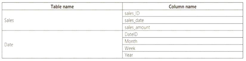
The Date table is marked as a date table.
DatelD is the date data type. You need to create an annual sales growth percentage measure. Which DAX expression should you use?
- A. SUM(sales[sales_amount]) - CALCULATE(SUM(sales[sales_amount]), SAMEPERIODLASTYEAR('Date'[DateID])
- B. (SUM(‘Sales’[sales_amount]) - CALCULATE(SUM(‘Sales’[sales_amount]), SAMEPERIODLASTYEAR(‘Date’[DateID])))/ CALCULATE(SUM(‘Sales’[sales_amount]), SAMEPERIODLASTYEAR(‘Date’[DateID]))
- C. CALCULATE(SUM(sales[sales_amount]), DATESYTD(‘Date’[DateID]))
- D. CALCULATE(SUM(sales[sales_amount]), SAMEPERIODLASTYEAR(‘Date’[DateID]))
Answer: B
Explanation:
SAMEPERIODLASTYEAR returns a table that contains a column of dates shifted one year back in time from the dates in the specified dates column, in the current context.
Reference:
https://docs.microsoft.com/en-us/dax/sameperiodlastyear-function-dax
NEW QUESTION 15
You have sales data in a star schema that contains four tables named Sales, Customer, Date, and Product. The Sales table contains purchase and ship dates.
Most often, you will use the purchase date to analyze the data, but you will analyze the data by both dates independently and together.
You need to design an imported dataset to support the analysis. The solution must minimize the model size and the number of queries against the data source.
Which data modeling design should you use?
- A. Use the Auto Date/Time functionality in Microsoft Power BI and do NOT import the Date table.
- B. Duplicate the Date query in Power Query and use active relationships between both Date tables.
- C. On the Date table, use a reference query in Power Query and create active relationships between Sales and both Date tables in the modeling view.
- D. Create an active relationship between Sales and Date for the purchase date and an inactive relationship for the ship date.
Answer: D
Explanation:
Only one relationship can be active.
Note: If you query two or more tables at the same time, when the data is loaded, Power BI Desktop attempts to find and create relationships for you. The relationship options Cardinality, Cross filter direction, and Make this relationship active are automatically set.
Reference:
https://docs.microsoft.com/en-us/power-bi/transform-model/desktop-create-and-manage-relationships
NEW QUESTION 16
You need to create the Top Customers report.
Which type of filter should you use, and at which level should you apply the filter? To answer, select the appropriate options in the answer area.
NOTE; Each correct selection is worth one point.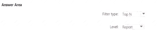
Solution:
A picture containing background pattern
Description automatically generated
Does this meet the goal?
- A. Yes
- B. Not Mastered
Answer: A
NEW QUESTION 17
Note: This question is part of a series of questions that present the same scenario. Each question in the series contains a unique solution that might meet the stated goals. Some question sets might have more than one correct solution, while others might not have a correct solution.
After you answer a question in this section, you will NOT be able to return to it. As a result, these questions will not appear in the review screen.
You are modeling data by using Microsoft Power Bl. Part of the data model is a large Microsoft SQL Server table named Order that has more than 100 million records.
During the development process, you need to import a sample of the data from the Order table. Solution: You add a WHERE clause to the SQL statement.
Does this meet the goal?
- A. Yes
- B. No
Answer: A
NEW QUESTION 18
Your company has affiliates who help the company acquire customers.
You build a report for the affiliate managers at the company to assist them in understanding affiliate
performance.
The managers request a visual showing the total sales value of the latest 50 transactions for each affiliate. You have a data model that contains the following tables.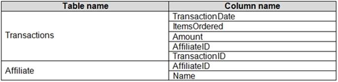
You need to develop a measure to support the visual.
How should you complete the DAX expression? To answer, select the appropriate options in the answer area. NOTE: Each correct selection is worth one point.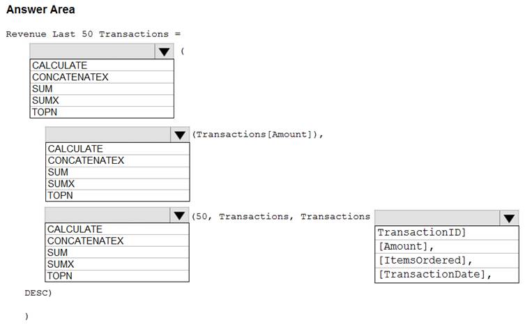
Solution:
Box 1: CALCULATE
Start with CALCULATE and use a SUMX.
CALCULATE evaluates an expression in a modified filter context.
Box 2: SUM
Box 3: TOPN
TOPN returns the top N rows of the specified table.
Box 4: [TransactionDate]
TOPN Syntax: TOPN(<n_value>, <table>, <orderBy_expression>, [<order>[, <orderBy_expression>, [<order>]]…])
The orderBy_expression: Any DAX expression where the result value is used to sort the table and it is evaluated for each row of table.
Reference:
https://docs.microsoft.com/en-us/dax/topn-function-dax
Does this meet the goal?
- A. Yes
- B. Not Mastered
Answer: A
NEW QUESTION 19
You have two tables named Customers and Invoice in a Power BI model. The Customers table contains the following fields: CustomerID
  Customer City Customer State Customer Name Customer Address 1 Customer Address 2 Customer Postal Code
The Invoice table contains the following fields: Order ID Invoice ID Invoice Date Customer ID Total Amount Total Item Count
The Customers table is related to the Invoice table through the Customer ID columns. A customer can have many invoices within one month.
The Power BI model must provide the following information: The number of customers invoiced in each state last month The average invoice amount per customer in each postal code
You need to define the relationship from the Customers table to the Invoice table. The solution must optimize query performance.
What should you configure? To answer, select the appropriate options in the answer area.
NOTE: Each correct selection is worth one point.
Solution:
Box 1: One-to-many
A customer can have many invoices within one month. Box 2: Single
For One-to-many relationships, the cross filter direction is always from the "one" side, and optionally from the "many" side (bi-directional). For
Single cross filter direction means "single direction", and Both means "both directions". A relationship that filters in both directions is commonly described as bi-directional.
Reference:
https://docs.microsoft.com/en-us/power-bi/transform-model/desktop-relationships-understand
Does this meet the goal?
- A. Yes
- B. Not Mastered
Answer: A
NEW QUESTION 20
......
Thanks for reading the newest DA-100 exam dumps! We recommend you to try the PREMIUM Dumps-hub.com DA-100 dumps in VCE and PDF here: https://www.dumps-hub.com/DA-100-dumps.html (141 Q&As Dumps)
